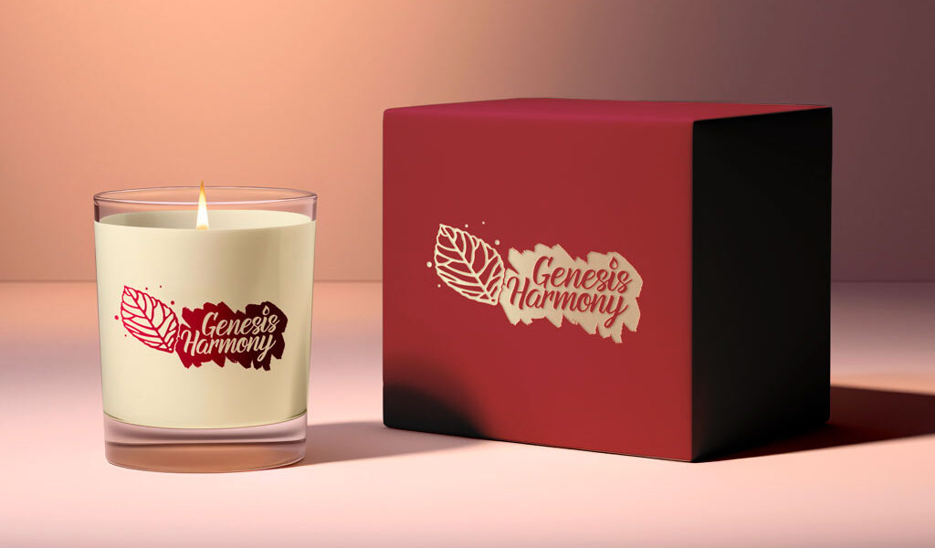
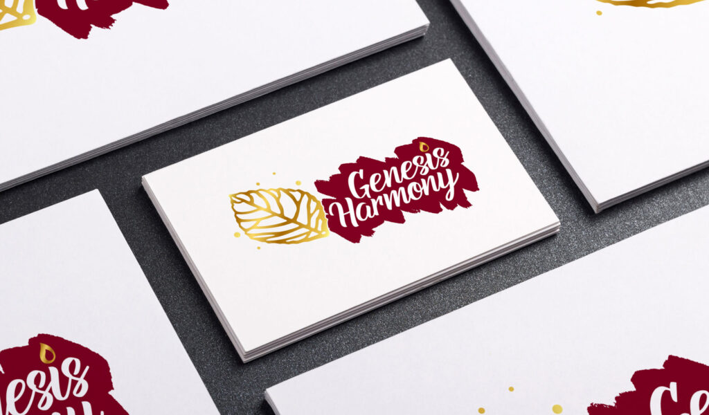
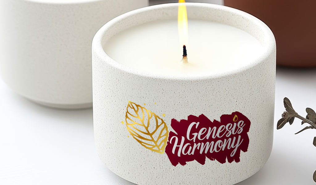
Genesis Harmony is a candle brand built around the themes of balance, serenity, and connection. The logo design was created to capture these core values through a clean and modern identity that feels both timeless and inviting.
Genesis Harmony:
Crafting a Unified Brand Identity
Color Palette: Harmony in Every Shade
The chosen color palette was designed to embody the essence of Genesis Harmony—balancing elegance, warmth, and purity. Each shade plays a role in communicating the brand’s identity, from deep sophistication to radiant light and calming neutrality.
Burgundy
#800020
Pure White
#FFFFFF
Golden Glow
#EEC856
Overview
The project focused on crafting a unified brand identity that aligns with the calming essence of Genesis Harmony’s candles. By blending elegant typography with subtle symbolism, the final design reflects harmony, warmth, and sophistication—qualities at the heart of the brand.
The logo was designed with versatility in mind, ensuring it works seamlessly across packaging, digital platforms, and promotional materials. Its simplicity and balance create a strong visual presence that strengthens brand recognition and leaves a lasting impression.
Project
Logo Design
Client
Genesis Harmony
What We Did
Brand identity development and logo design


